Roll-back and feedback on the new UX

Hello,

Thank you for the outstanding and generous efforts for the team that is actively developing the K8S Lens IDE and making it widely available for all. It really is a game changer in the Kubernetes world, and I cannot imagine living without it.

However, the latest September 2024 release is severely degraded in terms of performance, UI/UX, features and overall usability than the previous release as of August 2024.

I rolled back to the previous release 2024.8.291605 using this link. I’m running on a Mac ARM processor.

Mainly, here are my feedback points that made me roll-back:
1 - Seeing multiple clusters together on the side-bar should be optional as it’s a much more smaller niche use-case than connecting to only 1 cluster and see it full-fledged.
2 - The sidebar no longer shows many of the the components that used to appear before, especially CRDs.
3 - Shortcuts hardly work, ctrl+shift+P for example was 10x more seamless in the previous version.
4 - The UI takes ages to load the cluster, and ages to switch views. The new version hardly seemed usable at all.
5 - The colours, fonts, sizes, spaces, etc in the previous version were a lot clearer, bigger and better. Visually, I would choose the old version any day.
6 - Searching via Ctrl+F hardly responds.
7 - We still need a keyboard shortcut to switch namespaces by typing without any clicks.
8 - Overall performance, debugging, visuals were just so much better, easier, seamless and easier on the eye than the new version.

So kindly re-consider allowing the old UI/UX to co-exist with the new version, or in all cases, I would wait for more updates for the new version to mature before I can use it.

Thanks

2 Likes

Thank you for your valuable feedback. It is greatly appreciated and helps us continuously improve the experience!

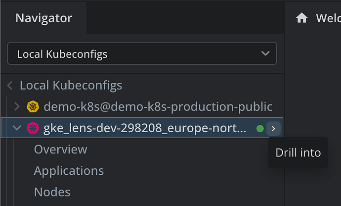
1 - Seeing multiple clusters together on the side-bar should be optional as it’s a much more smaller niche use-case than connecting to only 1 cluster and see it full-fledged.

For focusing into one cluster there is “Drill into” option in the Navigator:

Would love to hear if this helps!

2 - The sidebar no longer shows many of the the components that used to appear before, especially CRDs.

This sounds like a bug, all the same things should be there. Could you provide more info about this?

3 - Shortcuts hardly work, ctrl+shift+P for example was 10x more seamless in the previous version.

This is a known issue and we are working on it.

4 - The UI takes ages to load the cluster, and ages to switch views. The new version hardly seemed usable at all.

It appears that certain environment-specific issues may be contributing to the slowness. That being said, we are committed to incrementally improving the tab loading times to enhance overall performance.

5 - The colours, fonts, sizes, spaces, etc in the previous version were a lot clearer, bigger and better. Visually, I would choose the old version any day.

Let’s see what we can do here, I’ll pass the feedback to the team :blue_heart:

6 - Searching via Ctrl+F hardly responds.

By this, are you referring to actions like searching for Pods within a tab? If so, it could be related to an issue with tab focus. We’ll need to investigate this further to better understand the cause.

7 - We still need a keyboard shortcut to switch namespaces by typing without any clicks.

I completely agree. While the new namespace selector has improved in terms of keyboard accessibility, we acknowledge that it currently lacks a direct shortcut. Although it’s possible to reach it by tabbing multiple times, we understand this isn’t the most convenient solution.

8 - Overall performance, debugging, visuals were just so much better, easier, seamless and easier on the eye than the new version.

We recognize that there are still areas where performance can be improved, and we are actively working to address them. Regarding the overall visuals, we understand that achieving a design that satisfies everyone can be challenging, especially during major UI/UX transitions. Nonetheless, your feedback is invaluable, and we are taking it seriously as we continue to enhance the product.

I am using clusters that have OIDC setup and every once in a while I just get a lock next to certain clusters and I am not able to do anything on them. I am guessing that has to do with auth? I cannot seem to get the lock to go away(connecting/disconnecting) apart from restarting lens fully which also breaks the port-forwards I have open. This is really hammering my flow as it happens every 10 minutes.

One UX issue I experienced was that when opening a node shell from the Nodes tab, it was only accessible from the Nodes tab. If I switched to the Pods tab on the same cluster, the node shell was not accessible.

I have also rolled back to the previous version of Lens.

How did it work better in the previous versions? I’m trying to understand how the new UI breaks this flow.

Thanks for the feedback! If I understand this correctly you would prefer the behavior where terminal dock tabs are cluster-wide, meaning they stay at the bottom (dock) across different tabs for the same cluster?

Workaround: you can open node shell from Pods tab by opening the pod details, clicking the node and then clicking “Node shell”.

Correct, as with the previous version of Lens I would expect all terminal dock tabs to be cluster-wide.

Also, now that you’ve got the different tabs available, it would be super cool to see split-screen view, similar to VSCode, for having multiple tabs open side-by-side.

1 Like

The new version seems to be quite slow. Transitioning between different resource types is not as smooth as it used to be.

I very much like that it has Metrics server integration now, however other than that the update has been a noticeable downgrade.

Thanks for the feedback! As mentioned this is definitely something we want to improve.

Not necessarily the new UI that breaks it, but just in general the new update has caused this lock to appear and not be fixable without restart.

1 Like

One more question because I’m still not sure how we can fix the issue properly. Is the old version showing an error when OIDC token expires and you click “Reconnect” to make it go away?

Hi,
I also rolled back to the old version, after seeing this completely broken UI/UX.

  • no favorites anymore.
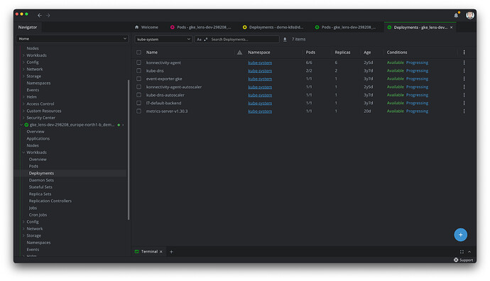
  • Tabs from different clusters are mixed now
  • bad readability, smaller text and ><
  • I’m also missing icons for the main entries in the list (e.g. Nodes, Workloads, Network,…)

→ This is so much worse than the last version. :confused:
Won’t update, until this is fixed, maybe switch to another tool.

@a.bauer Thanks for the feedback. It is important for us to see these common patterns in users to keep improving the product.

  • no favorites anymore.

We are currently working to include an improved mechanism to add favorites, so you can jump easier to certain resources.

  • Tabs from different clusters are mixed now

That’s right, this is intentional as it is a step forward to allow user to see resources from different clusters easier (potentially simultaneously in the future). You can drag the tabs and organize them in a way that makes sense for your usage, you can colorize the clusters according to your preference or add icons in Cluster Settings, to identify those tabs easier. We are working to create easier ways to jump between them.

  • bad readability, smaller text and ><

You can increase the spacing for tables in the Preferences > Tables section > Row Line Height or the font-sizes for editors in Preference > Editor > Font-size to tweak the visual appearance. Alternatively (maybe best for your case), you can “Zoom-in” into the content of the whole app to make it bigger, as you would on a browser by pressing Cmd + (on Mac) or Ctrl + (on Windows). That should help with the readability as it will scale up all the content accordingly.

  • I’m also missing icons for the main entries in the list (e.g. Nodes, Workloads, Network,…)

This was an intended decision to have a cleaner look in the navigator and allow easier navigation; however, we’ll definitely consider your feedback for future adjustments.

Overall, thanks for providing the feedback, we’ll take all of it under consideration as we keep making adjustments to this new version.

Hi,

We are currently working to include an improved mechanism to add favorites, so you can jump easier to certain resources.

Maybe I re-visit Lens, after you fixed this.

Mixed tabs:
This increases the likelines of applying changes to the wrong cluster. You should at least consider an optional automatic grouping of the tabs based on the clusters.

This was an intended decision to have a cleaner look in the navigator and allow easier navigation;

Sorry, but you achieved the opposite. Icons help to quickly understand which option you are looking at, without reading it every time. Icons help to navigate quickly, leaving the out makes it harder!

As I said, I might re-visit you tool, after you fixed what you broke with this update! You had a great tool and where on the right track, but following the mainstream design guides out there does not automatically help to make a well-functioning, quick and safe-to-use tool.
As a DevOps I want tools that support an approach which helps me to avoid potentially high impact errors. Lens just dropped out after the upgrade.