I saw a similar question from 2024, asking why everything has been “greyed” for status where previously you could quickly see status as green orange or red?
It seems like such a bad UI decision, at least let people decide if they want to struggle with grey or not.
This is on version 2026.3.160808-latest
Before it was quick and easy to quickly scan and see the state, now with grey status it’s not.
Hi @agericke , and thank you so much for taking the time to report this! We really appreciate the detailed feedback — it helps us a lot.
If I understand correctly, you’re referring to something like the coloured pod status overview we have in the Node Details panel under the Pods section — where pods are shown with coloured indicators based on their state (CPU, Memory)? Just want to make sure we’re looking at the right area.
To help us investigate properly, could you share a bit more detail?
- Where exactly are you seeing the greyed-out status? Is it in that Node Details pod overview, the pod list, the container status menu — or is it everywhere across the UI?
- A screenshot would be incredibly helpful so we can pinpoint exactly which indicators lost their color
- Do you have metrics configured in your cluster settings? (Prometheus, Victoria Metrics, etc.) — the colored status overview depends on this being set up correctly
- Which OS are you running on? (macOS, Windows, Linux?)
The more we can see, the faster we can get this sorted out. Thanks again for flagging this!
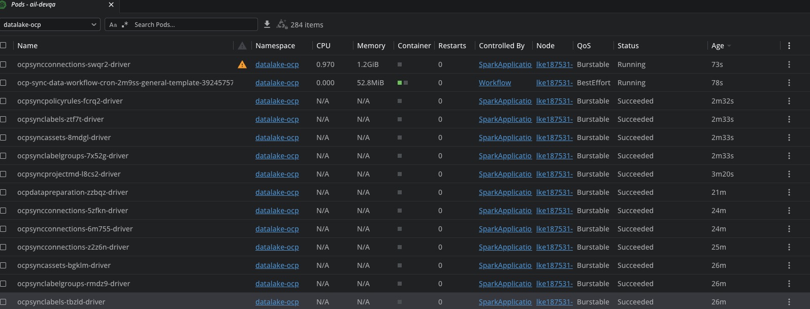
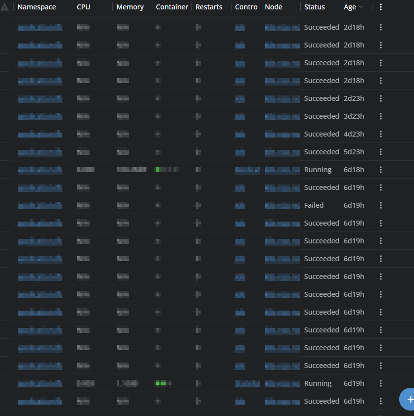
I’ll attach a screenshot, but basically any status.
As an example, looking at Wokloads - Pod, the status are all grey, this makes a quick view difficult.
Same with jobs and their various conditions.
These all had their respective colours Red, Green, Orange for their statuses.
It just seems like an odd design decision, why “break” something which was fine and working?
At the very least make it an option to select, if someone prefers the grey status indicator, let them make that choice, or vice versa.
We’ve got metrics/monitoring, but this has nothing to do with that, this is purely on the Lens side.
Hey @agericke and @obigelma — thank you both so much for reporting this and for taking the time to share screenshots and details! Your input was incredibly helpful in tracking this down quickly.
Great news: we’ve identified the root cause and already have a fix in place. The color-coded status indicators (green for Running, orange for Pending, red for Failed, etc.) were unintentionally removed during an internal code refactor — it was never a deliberate design decision to remove them.
You’ll see the colors back in an upcoming build. We really appreciate you raising this — community reports like yours help us catch regressions fast and keep Lens great for everyone. Thank you!
Awesome news, thanks for the quick response on this crothmann.
Really appreciate the quick attention this matter has received, and also great to have helped improve the product a little bit, even if it’s only illuminating a bug.
Latest release has a fix for this, it is currently rolled out on auto-update gradually, if you need this quickly you can download the latest from the website Lens – Download